Blog ≫ 2020 ≫ popEx got graphs
Couple of important steps for popex today.
- I have twenty automated traders buying and selling all day and it's not broken anything.
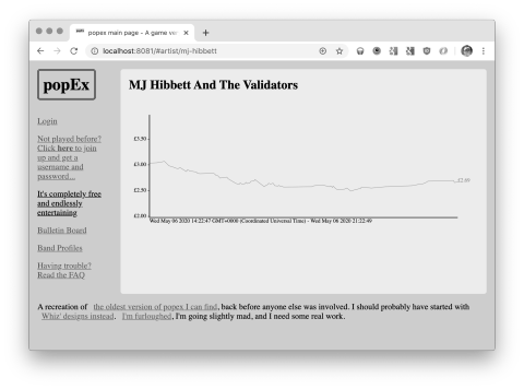
- I have graphs of the price changes these traders are affecting!
I know I've not done exactly the same technique I did last time either for the price changing mechanics, or for the graphs, but it mostly seems to work. The new graphs are so much faster to build than the originals must have been, they're not even real images this time but SVGs which makes them much quicker to build on the fly.
Most of the shares are trending downwards, but I think as new players are added and there's more buying than selling this will correct itself. Here's an example:
